Therapy Life
As a Lead UX Designer at TherapyLife, I led the design of an internal dashboard to help therapists manage sessions, notes, client histories, and payments in one place.
Collaborated with stakeholders, engineers and users to identify workflow gaps and redesign the experience from the ground up.
Lead UX Designer
Role:
Team:
Project Manager
Designers
Engineers
Timeline:
4 months
Tools:
Figma
Google Analytics
HotJar

TherapyLife simplifies how therapists handle sessions, notes, and client care
Project Overview
TherapyLife is a B2B SaaS platform designed to support mental health professionals in managing their daily practice. From scheduling and session notes to client management and payments, it offers a streamlined, all-in-one tool built to reduce friction and improve therapist efficiency.
My Responsibilities
As a Lead Designer, I led the end-to-end UX design of an internal dashboard for therapists. I collaborated with stakeholders, engineers, and a cross-functional team across design sprints, from research and journey mapping to wireframes, UI design, usability testing, and design handoff. The dashboard streamlined workflows around sessions, notes, availability, and payments, reducing drop-offs and improving overall task flow.
Problem
Business Problem
Therapists were dropping off key workflows because the existing systems were fragmented and unintuitive. Three core problems emerged:
No Clear Session Prep Flow
Users lacked a quick way to recall past sessions. Preparation was fragmented.
Session Notes Scattered or Forgotten
Notes were stored in external apps or notebooks, easy to lose, forget, or delay writing.
Hard-to-Track Availability → Missed Bookings
Users had no centralized way to mark working hours, leading scheduling errors.
These gaps created friction for therapists who needed consistency, structure, and ease across their daily workflows.
Our Goal
Design a unified dashboard that:
Simplifies day-to-day workflows
Centralizes all session-related tools
Minimizes missed revenue due to scheduling or payment friction
Encourages better preparation and documentation
Research
Strategy & Approach
I collaborated with 2 other designers and a product manager in agile sprints over 4 weeks, using collaborative design tools and continuous validation to ensure usability at every step.
User Research & Interviews
Conducted in-depth interviews with 6 therapists and 2 practice managers to explore behaviors, frustrations, and needs around scheduling, note-taking, and client management.
Key Insights
8 participants interviewed
12+ hours of qualitative data collected
4 major friction themes identified
90% of therapists used 3+ tools daily (google Sheets, Docs, Notion)
3 out of 4 reported scheduling or availability issues at least weekly
5 out of 6 therapists admitted to forgetting or delaying notes post-session
User Persona
To design a helpful dashboard, we needed to understand what therapists deal with every day. Based on interviews, we created a user persona to represent their goals, struggles, and needs. This helped us stay focused on solving real problems throughout the design process.

Journey Mapping
We mapped a typical therapist’s daily workflow to better understand where friction and drop-off were occurring. This helped us prioritize design decisions based on real behaviors and mental load moments.

Therapist daily Journey
Ideation
Brainstorming & Sketching
We kicked off the design phase with collaborative brainstorming sessions and quick sketches to explore layout ideas and user flows. These early sketches helped us visualize solutions for key pain points and align the team before moving into wireframes.
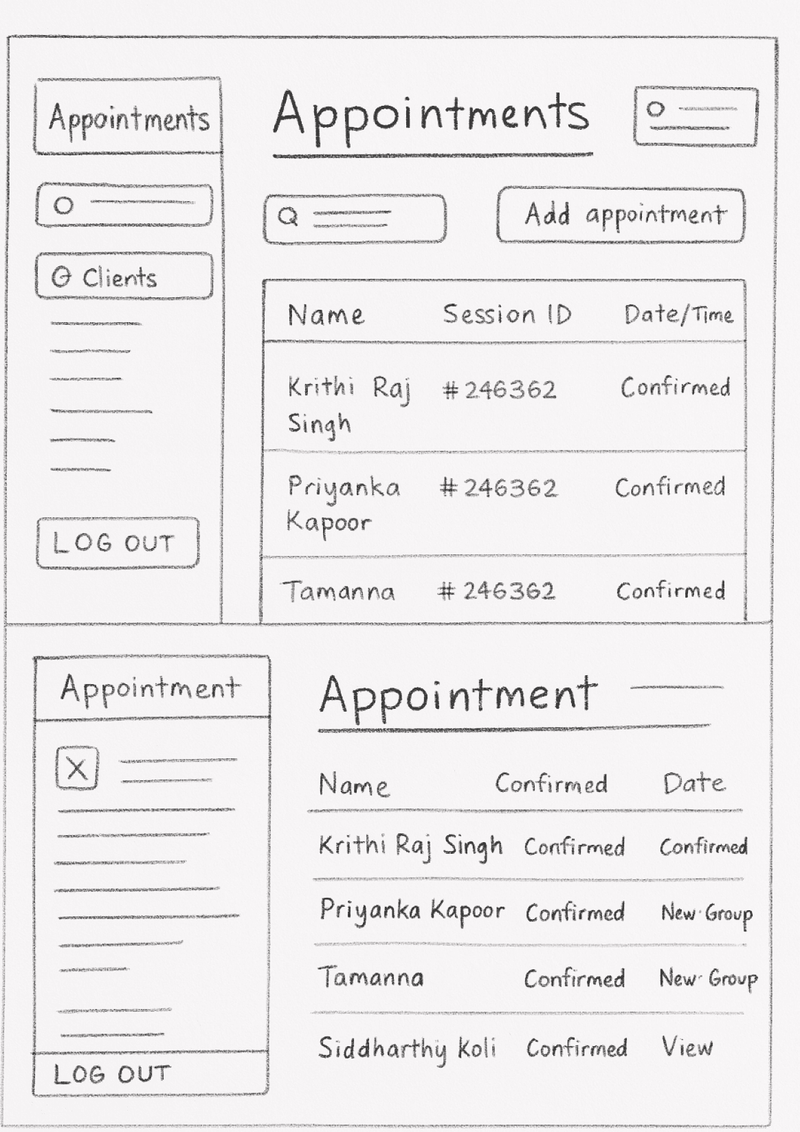
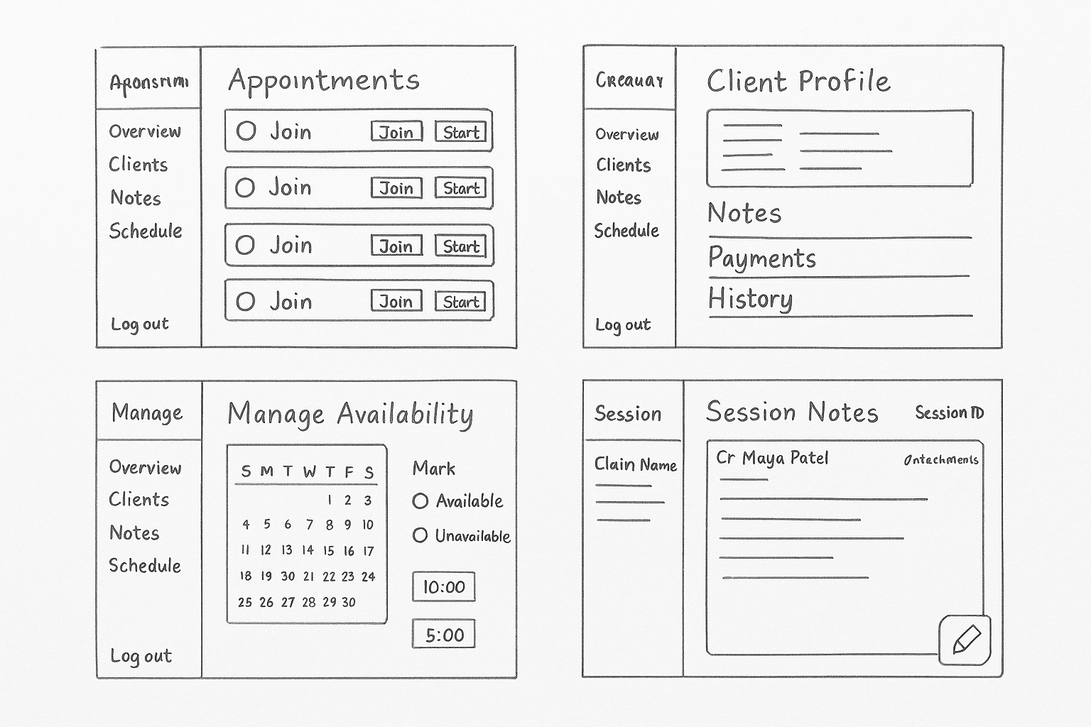
Wireframes
Based on those concepts, we designed a modular system focused on clarity and usability. Our wireframes included:


Design
Styleguide
Colors
Primary Colors
Green
#285953
Black
#222222
White
#FFFFFF
Secondary Colors
Drak Gray
#414040
Gray
#717171
Medium
#CCCCCC
Light
#6A6868
TYpography
UI Design
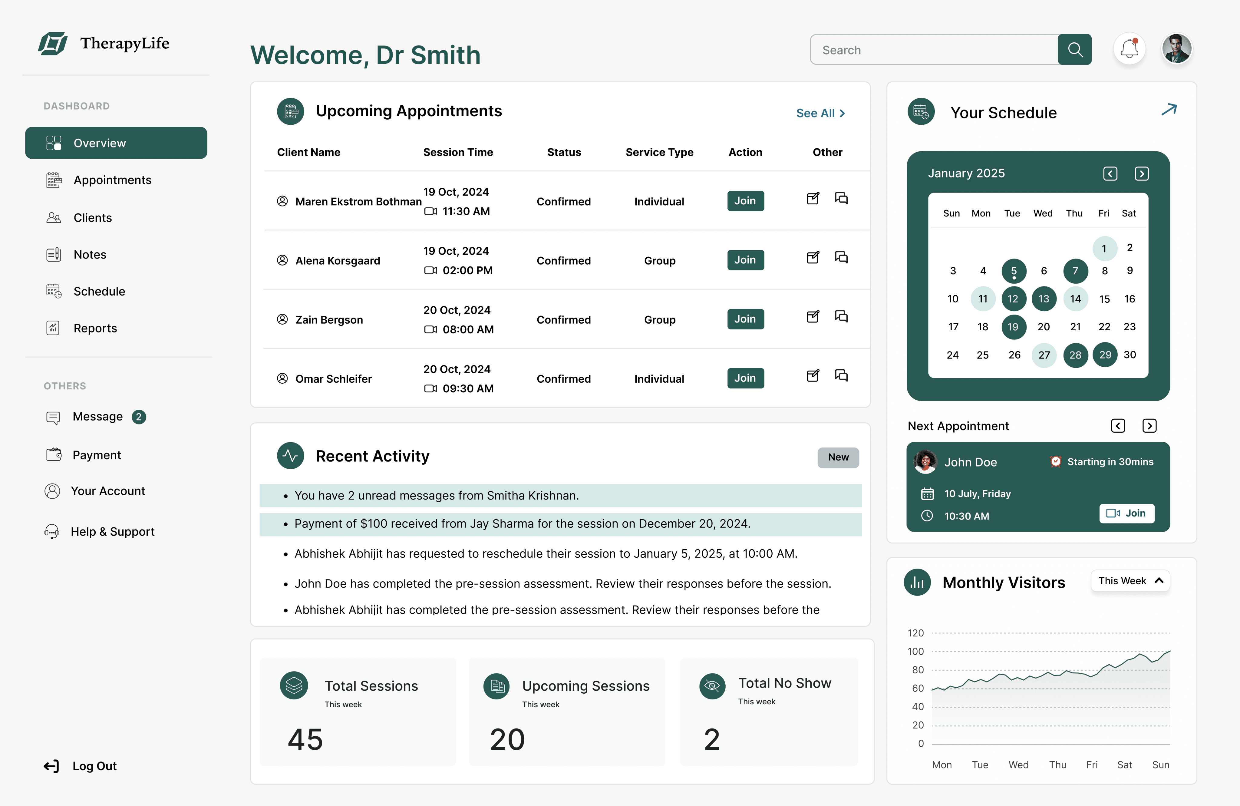
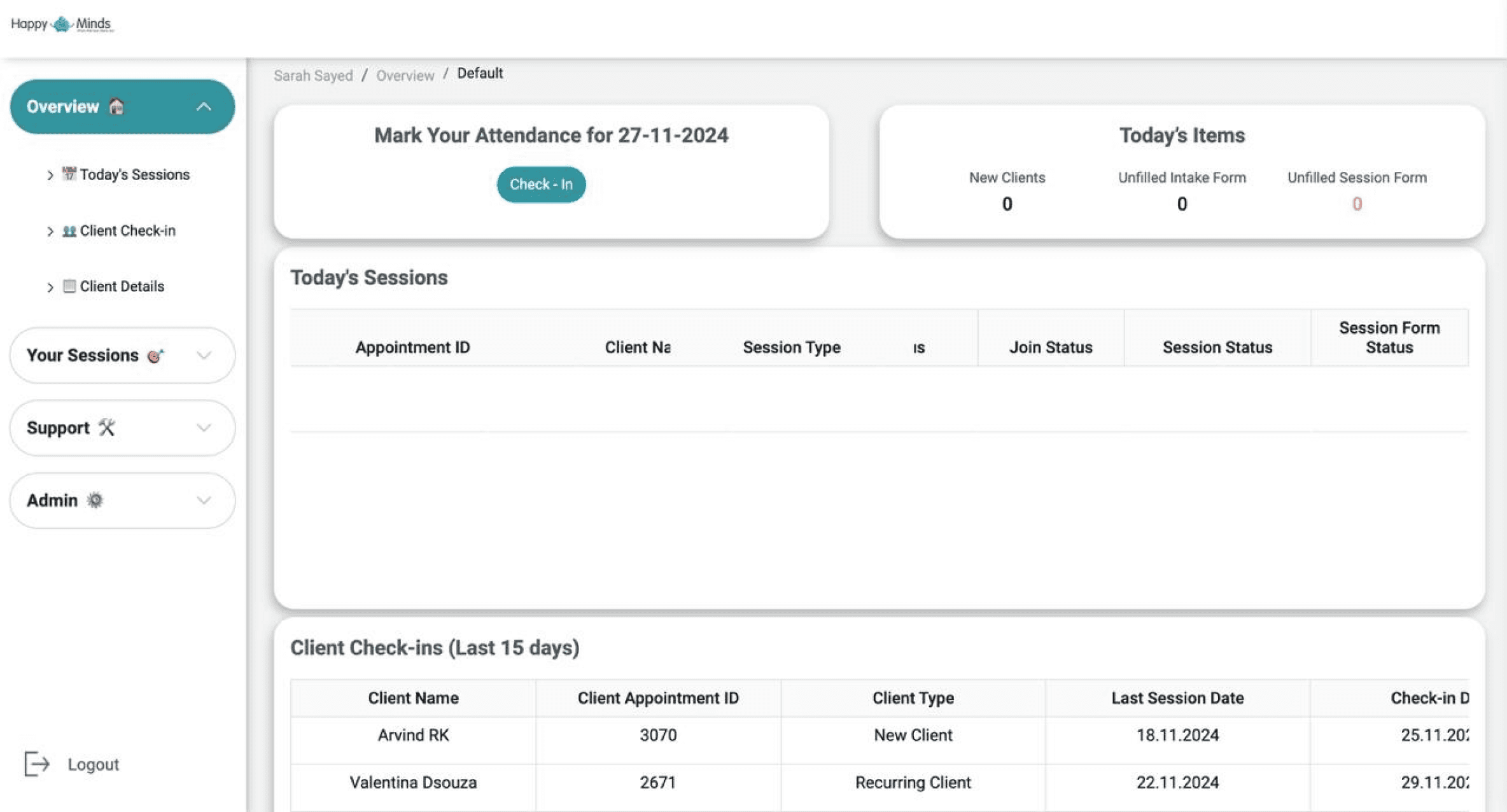
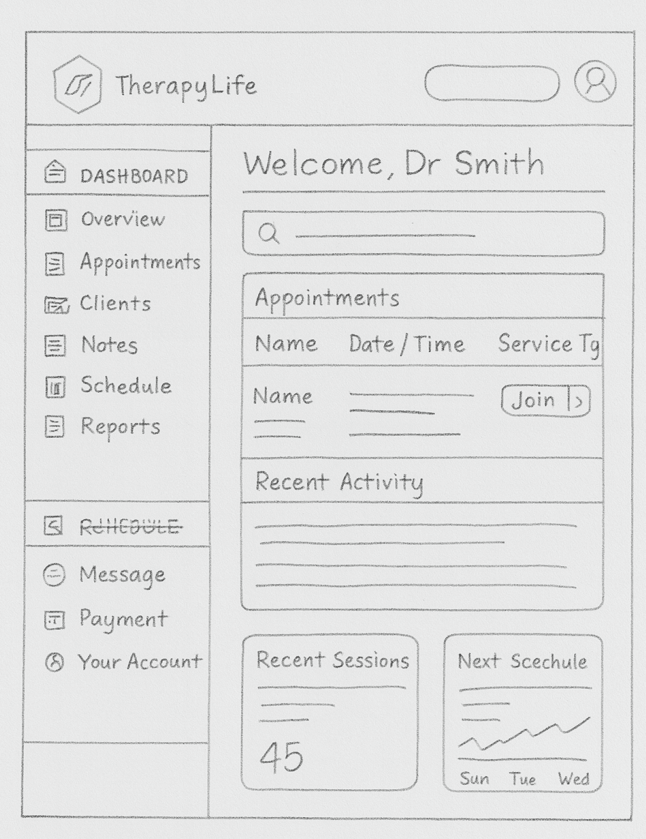
Dashboard as the Daily Control Center
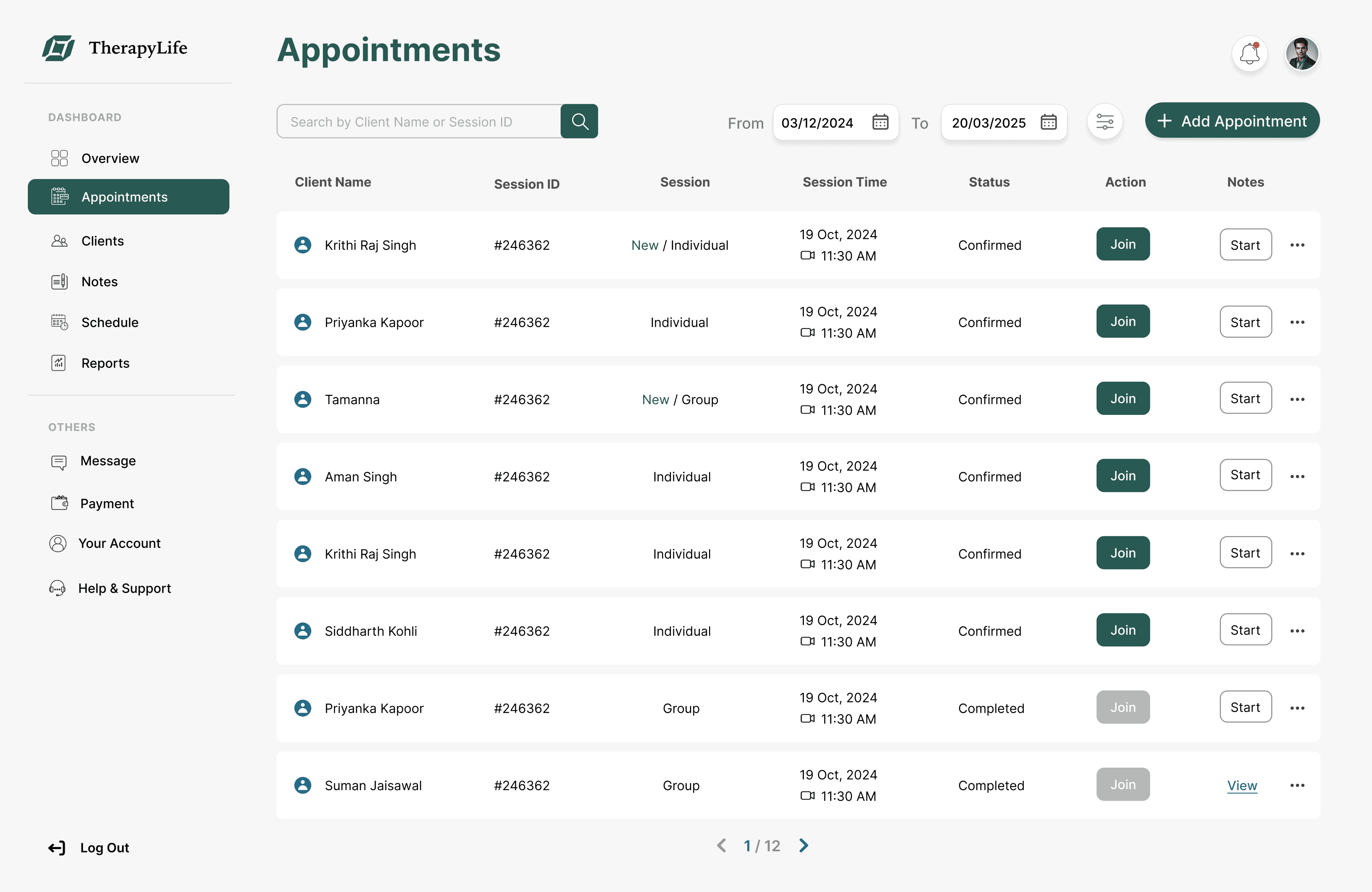
The redesigned Dashboard provided a focused overview of the therapist’s day with widgets for “Upcoming Appointments,” “Total Sessions This Week,” “No-Shows,” and unread notifications.
This gave therapists a clear starting point and reduced mental clutter by surfacing only what was immediately relevant.
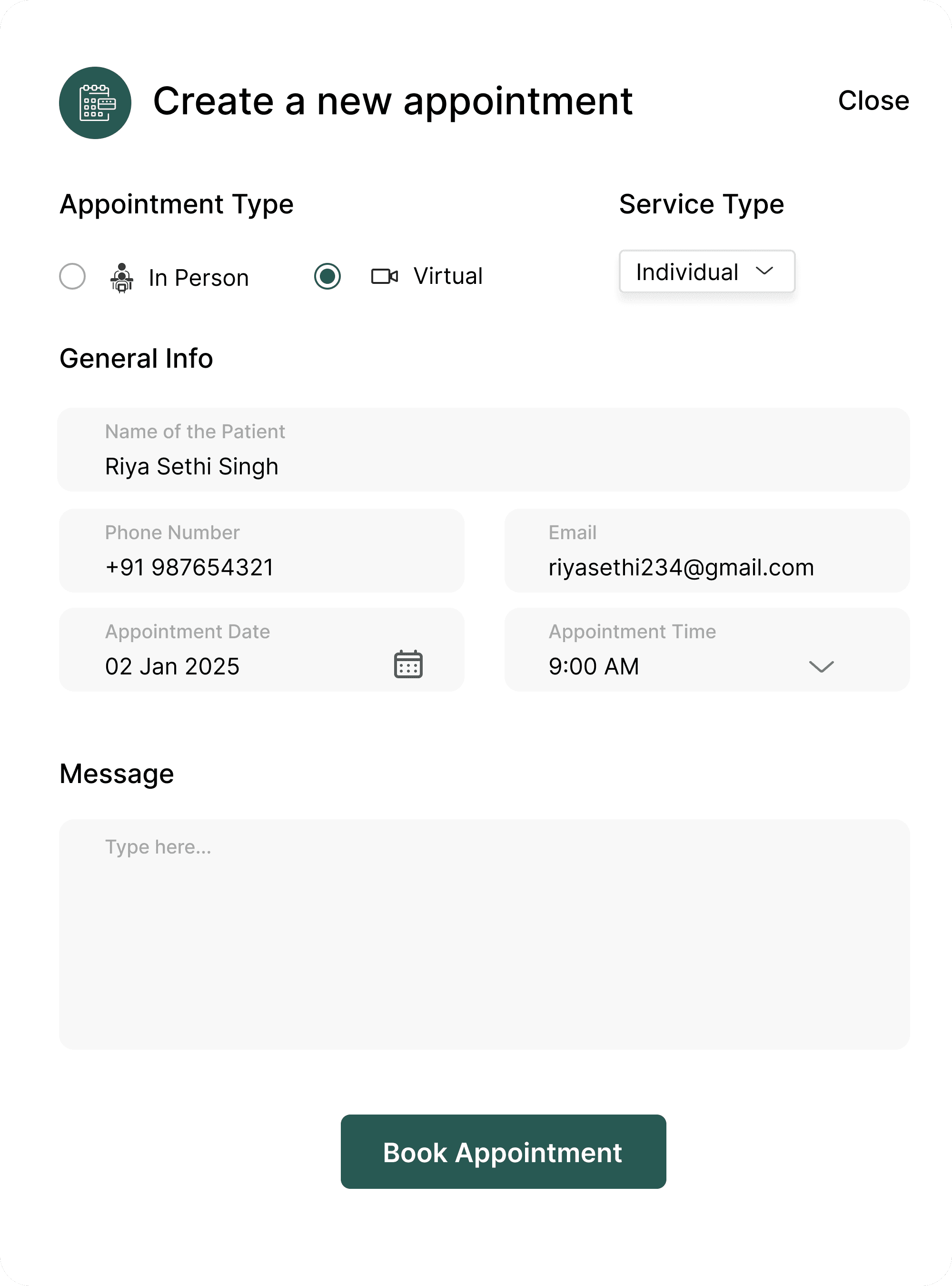
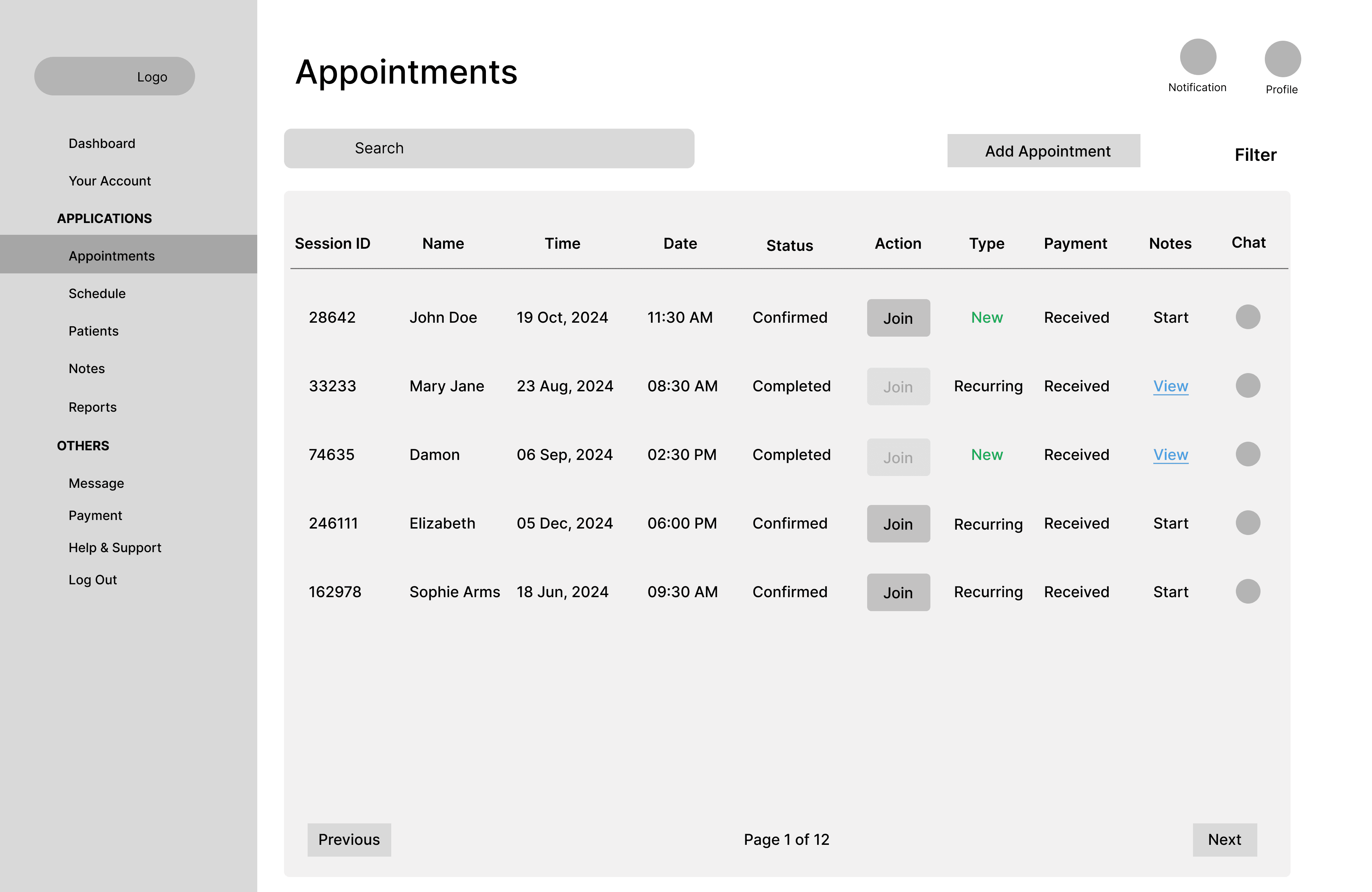
Appointment Blocks with Inline Actions
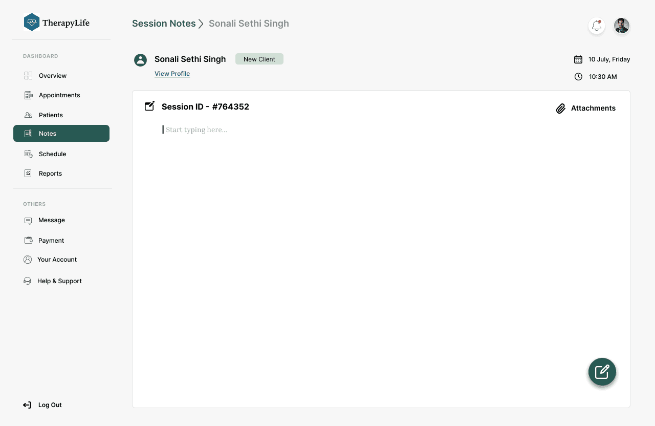
By adding “Join” and “Start Notes” buttons directly within each appointment row, we helped therapists stay in flow reducing task drop-offs and improving session follow-through.
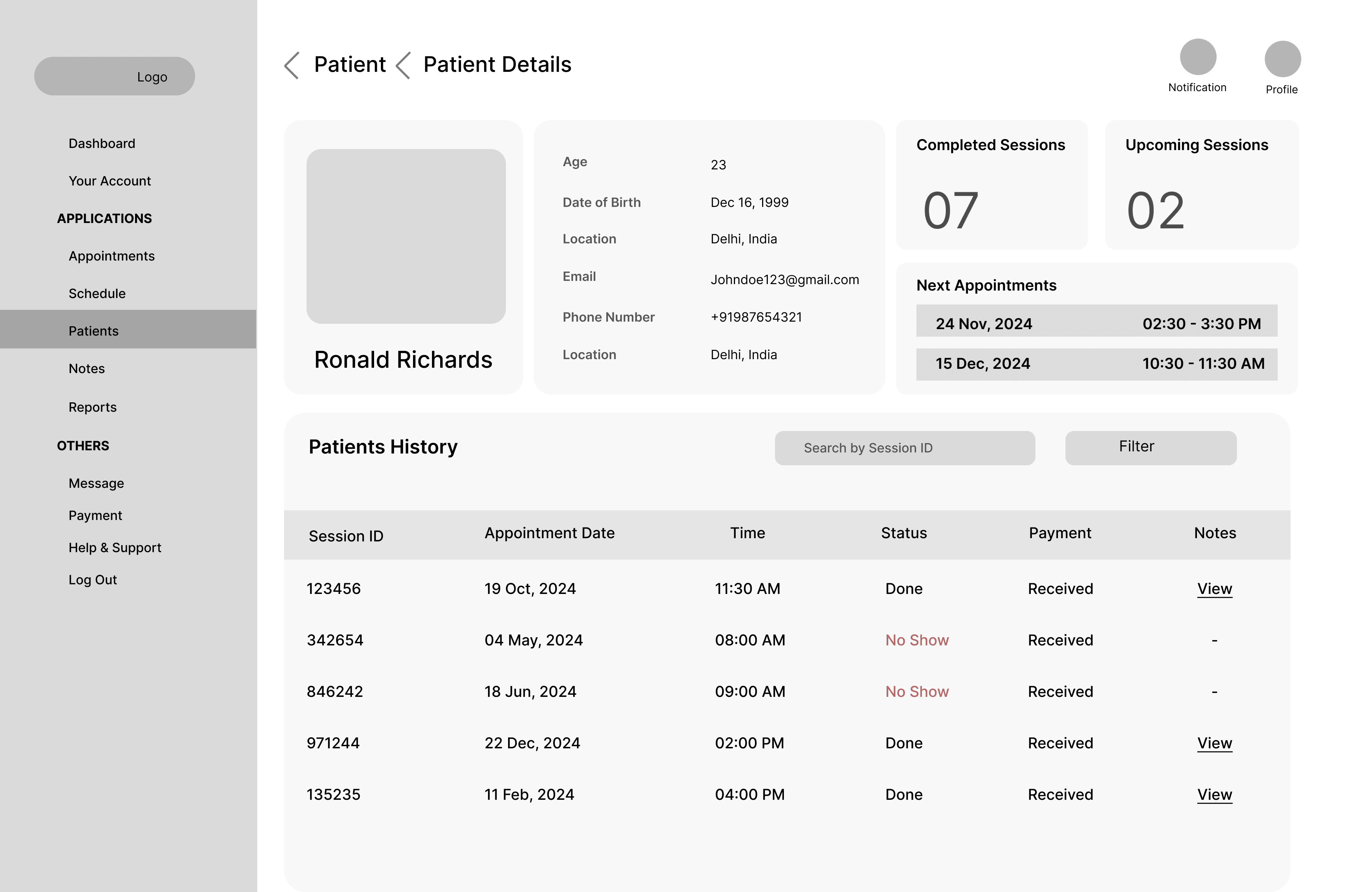
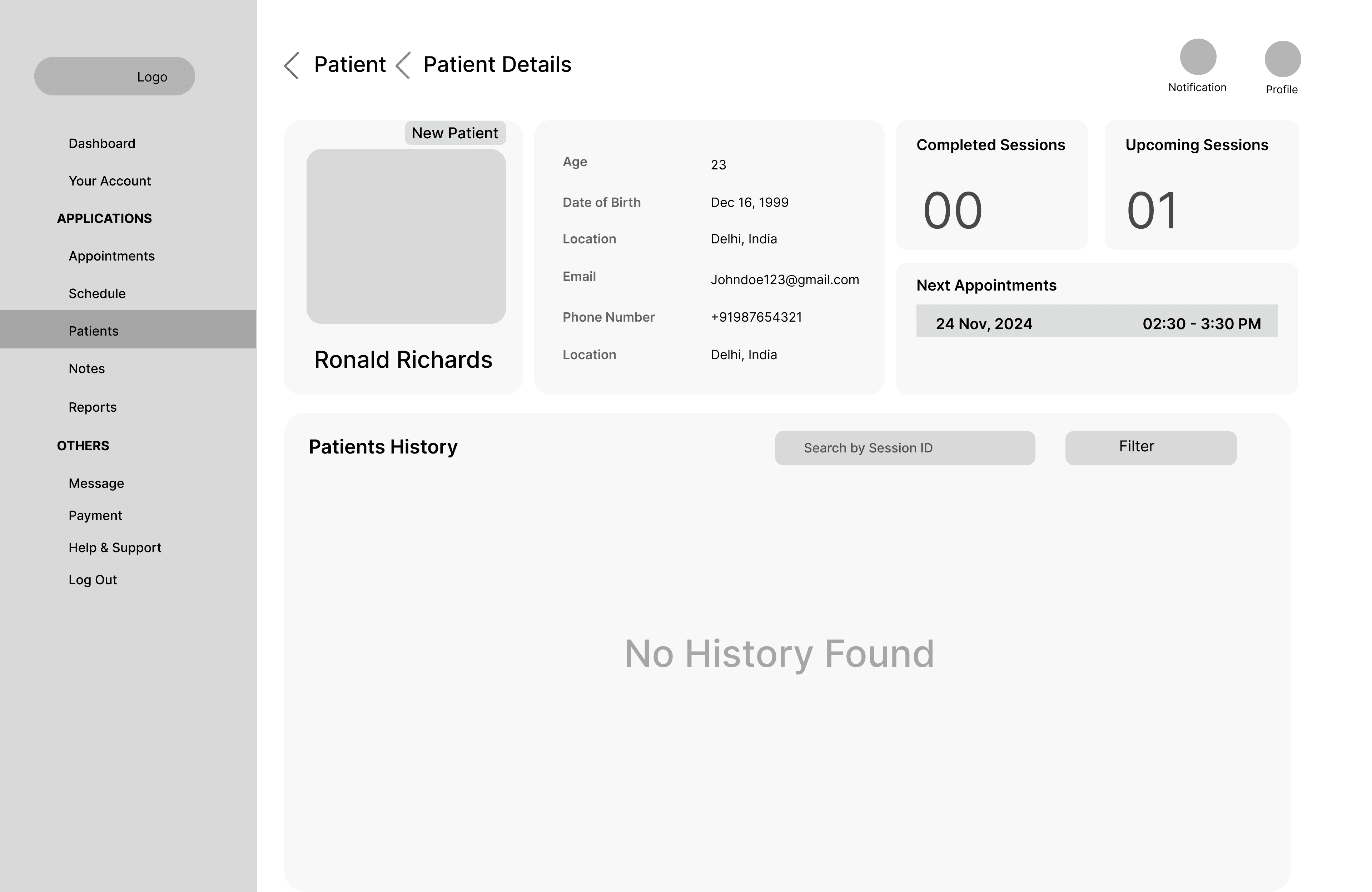
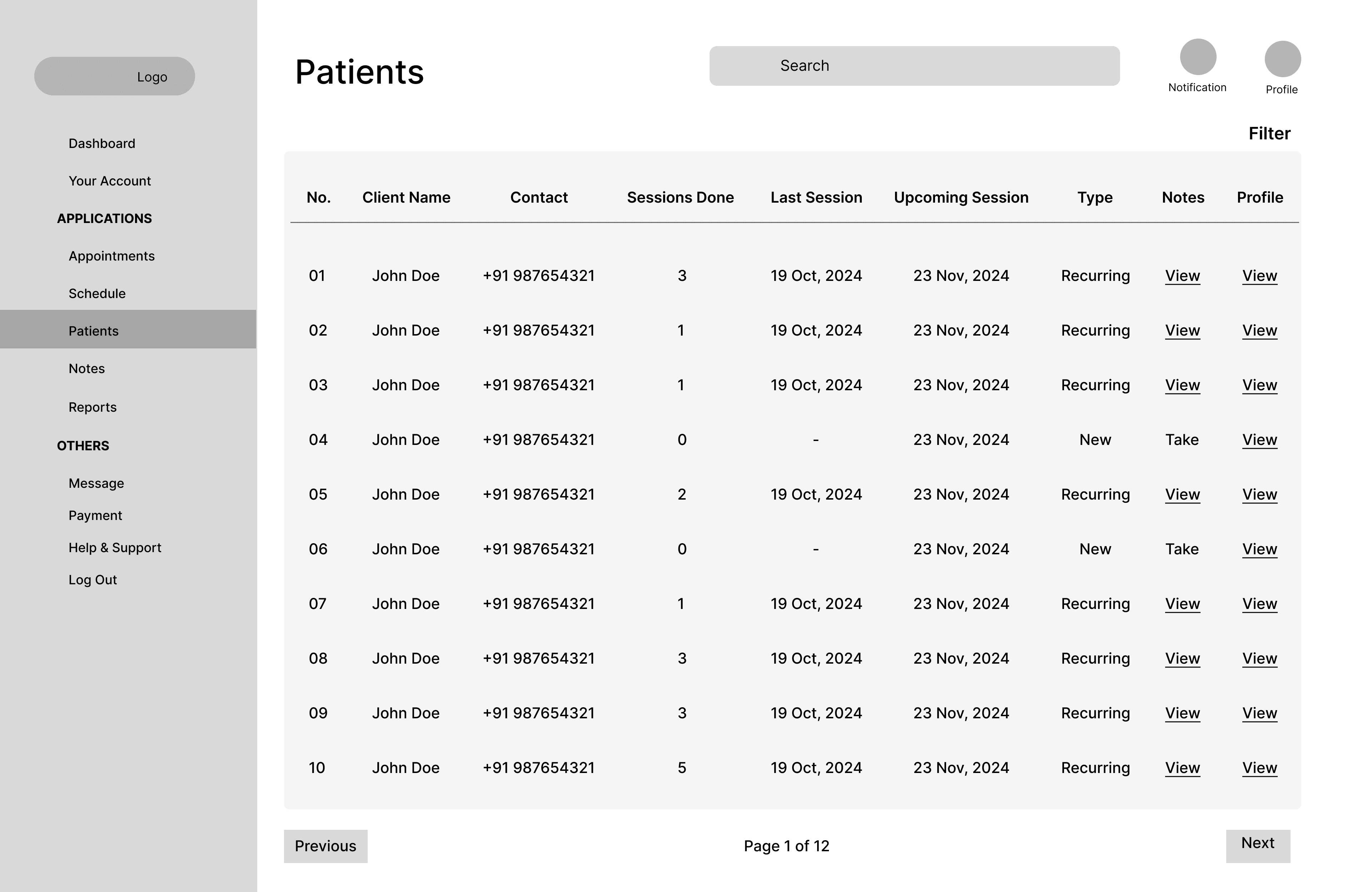
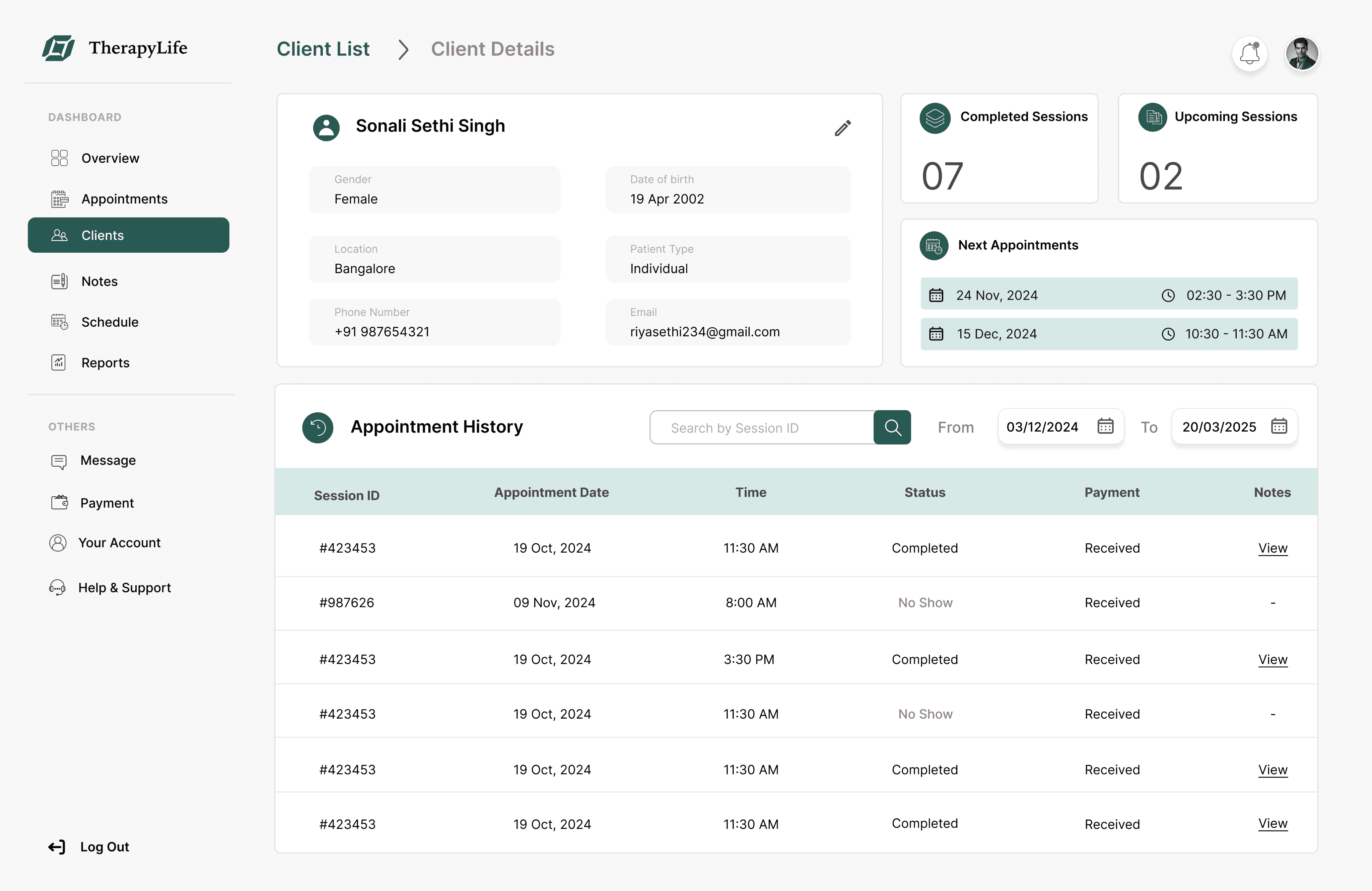
Unified Client Profiles
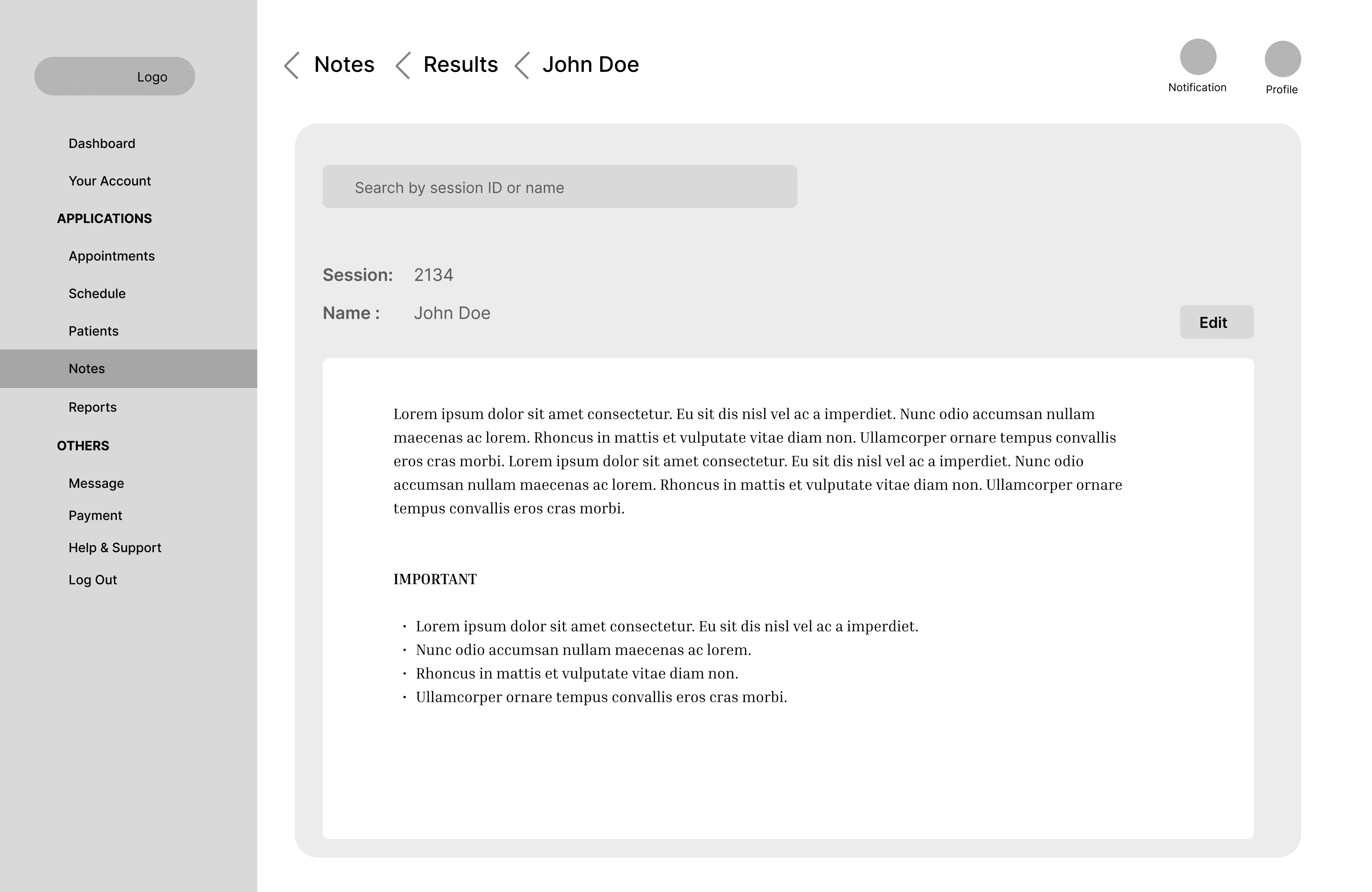
Each client profile now includes demographics, notes, payment status, and session history in one place. This eliminated the need to switch between tools, making prep and follow-up significantly faster and more organized.
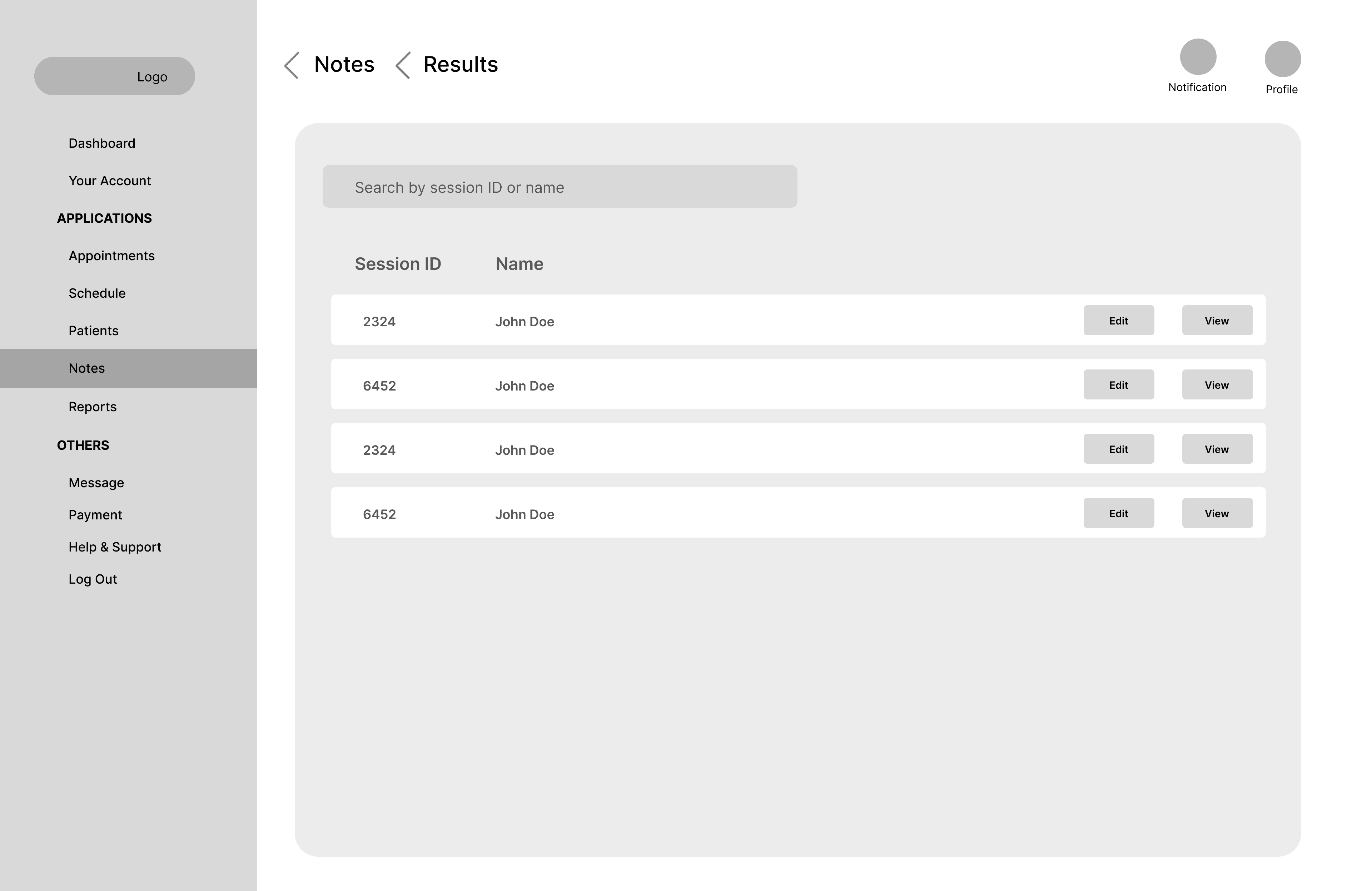
Contextual Note-Taking

Smart Availability Calendar
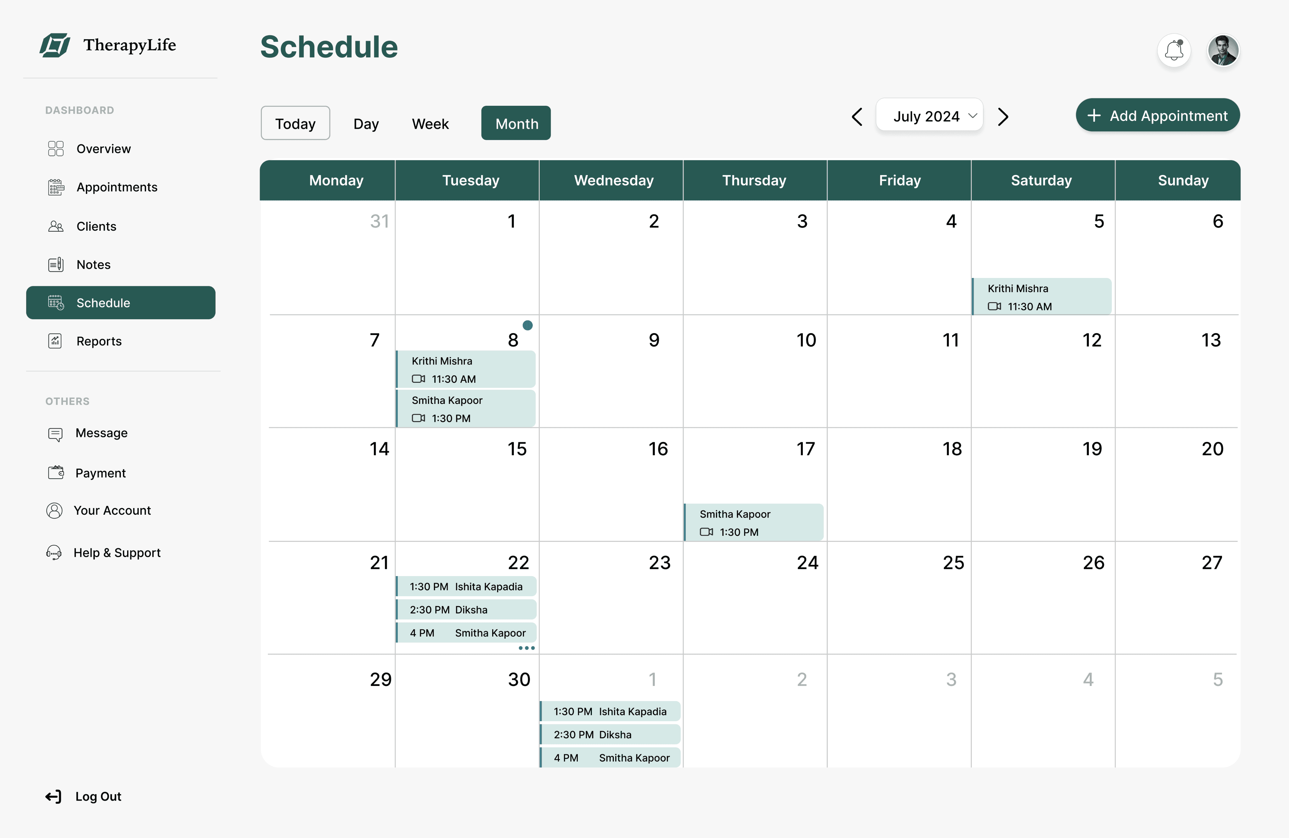
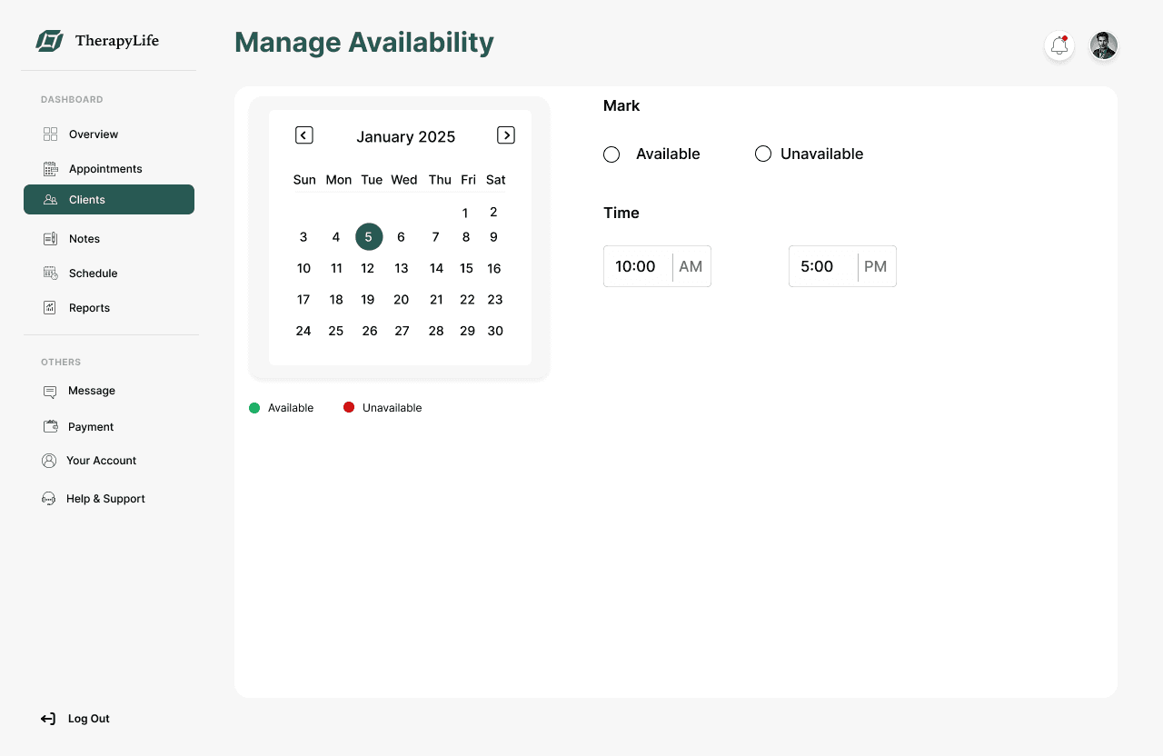
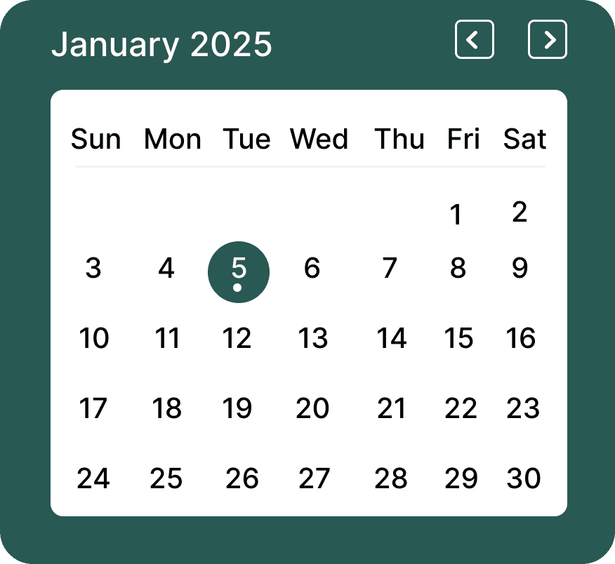
Therapists could manage and update their working hours directly within the calendar view. This improved scheduling accuracy and reduced admin overhead from double-bookings or missed blocks.
Usability Testing & Results
We conducted two rounds of moderated usability testing with 8 participants including therapists and practice managers to evaluate the effectiveness of our redesigned dashboard. Participants were asked to complete key tasks such as checking availability, starting session notes, and reviewing client details.
Results and Impact
📅
30% Improvement in Schedule Accuracy
The availability calendar reduced double-bookings and unintentional open slots, improving reliability and reducing admin overhead..
⏱️
50% Faster Task Completion
Usability testing showed therapists completed core tasks (e.g., finding a session, starting notes, checking payment status) 50% faster on average compared to their previous system.
🔽
35% Faster Session Prep Time
Centralized client profiles reduced the time spent searching for past session details or notes, improving pre-session readiness.
🔽
40% Drop in Missed Notes
Thanks to contextual note-taking directly from the Appointments page and dashboard, therapists were more likely to complete notes immediately after sessions.
What I learned
In this project, I became proficient in the iterative design process.
Usability testing isn’t optional, it revealed subtle labeling issues we hadn’t anticipated.
Small UI decisions (like pre-filling session notes) drive big behavioral changes.
Dashboards must not just show, they must guide. Data visualizations gave therapists clarity and confidence in their week.